 LAIINA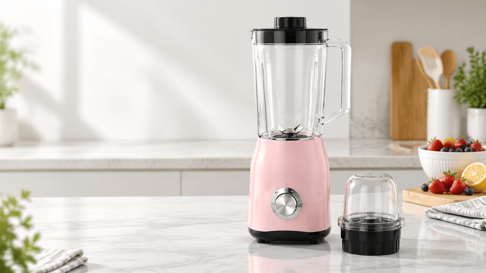
A private-label portable blender can look distinctive online but inconsistent in a real assortment if the housing, lid, cup and logo colors are selected independently. A bright housing, matching lid and dark logo may sound straightforward until the cup finish reduces contrast or each component requires a separate approval.
A more reliable approach is to build a controlled color system before requesting quotations. Before contacting a kitchen blender supplier, define one primary brand color, one neutral option and a limited number of coordinated combinations. Then ask which components, finishes and decoration methods can be customized on the portable juice blender model you are considering.
For most private-label inquiries, specify two or three coordinated product colorways: one core brand color, one neutral shade and, only where commercially justified, one seasonal or accent option. Identify the housing, lid, cup, button and logo colors separately. Ask the supplier to confirm available finishes, color-matching references, sampling requirements and whether each combination is quoted separately.
Stage 1: Set Your Portable Blender Private Label Colors
Begin with the product’s role in your assortment rather than with a long list of color names. Decide whether the portable blender will be a hero product, a supporting item in a wider appliance range or a promotional SKU. A hero product may need a recognizable signature color, while a supporting item may work better with a neutral body and restrained logo treatment.
Limit the first RFQ to combinations you could realistically approve and sell. A practical starting structure is:
- Core colorway: the main brand or launch color for the primary SKU.
- Neutral colorway: white, black, gray or another approved neutral for broader channel fit.
- Optional accent: a second branded shade only when it supports a clear assortment or campaign purpose.
When comparing portable blender models for private label, keep the model, component configuration and color plan connected. A color decision is useful only when the supplier can quote it clearly and reproduce it consistently.
Stage 2: Map Color Across the Product
Decide which surfaces should carry the brand identity. The housing usually creates the strongest shelf signal, while the lid, drinking cup, base ring, button and blade cover can either continue the same color or provide controlled contrast. Do not assume that every visible part uses the same material or finish.
Ask the supplier to define the customization boundary for each component. A two-tone design may differentiate the product without requiring a separate color treatment for every small part. Confirm whether the cup is transparent, tinted, frosted or opaque, since the visual result can change when the contents are visible.
| Element | Buyer decision | Supplier confirmation |
|---|---|---|
| Housing | Primary brand shade and surface finish | Available color process, finish options and reference sample |
| Lid and base | Match, neutral contrast or accent | Whether parts can be colored separately and quoted separately |
| Cup | Clear, tinted or coordinated appearance | Material appearance, transparency and color consistency |
| Button and details | Brand color, black, white or metallic effect | Decoration limits and legibility after production |
Stage 3: Turn the Palette Into an RFQ Brief
A supplier cannot price or sample a color concept accurately from a mood board alone. Prepare a short specification sheet with one line for each component and proposed colorway. Use consistent names such as “Core Green,” then attach a physical reference, standardized color reference or approved visual file where available.
Your OEM/ODM inquiry should state whether the color is a target reference or an exact approval requirement. Include the selected model, component list, surface finish, logo position, logo color, artwork format and number of colorways to be sampled. Ask the supplier to separate standard options from custom treatments so quotation comparisons remain clear.
Also ask whether the same color reference can be applied across plastic parts and packaging print. Different materials and processes may produce different visual results, so review the actual product components instead of relying only on a digital render.
Stage 4: Align Logo Treatment With the Color System
Test the logo against the darkest and lightest proposed surfaces. A white logo may disappear on a pale housing, while a dark logo may lose clarity on a deep color or textured finish. Specify the logo location, approximate size, orientation and preferred decoration method, then request a visual or physical sample.
Common blender logo printing options may include surface printing, a label, an applied mark or another decoration method selected by the supplier. The suitable method depends on the component and finish, so treat these as options to verify rather than guaranteed capabilities. Provide vector artwork where possible and clearly identify the approved logo colors.
For portable blender packaging design, use the same color names and logo rules as the product brief. Ask for a packaging mock-up showing the exact product colorway, background color and logo placement. This reduces the risk of a box suggesting a different shade from the product inside.
Stage 5: Approve the Color Standard Before the Quote Becomes an Order
Review samples as an assortment rather than as isolated parts. Place the housing, lid, cup, logo and proposed packaging together under consistent lighting. Check hue, gloss, texture, contrast, logo readability and the relationship between colorways.
Record the approved result in writing. Your approval file should identify the product model, component, color reference, finish, logo artwork version and packaging artwork version. If the sample differs from the target, state whether the supplier should adjust the color, accept the variation or provide another sample.
Before confirming production, ask the supplier to include the approved color references in the quotation or order documentation. Confirm how color deviations will be handled during inspection. This is not a certification claim; it is a practical way to keep the approved private-label appearance traceable.
Keep the Assortment Distinct Without Making It Hard to Manage
The main risk is not having too few creative ideas. It is creating more combinations than you can sample, explain, approve and reproduce. Separate “must match” elements from “can vary” elements. For example, the housing and logo may require strict control, while an internal or less visible component may remain a standard neutral if it does not affect the brand presentation.
A private label blender supplier should respond clearly to your color brief, identify which choices affect the quotation and show how approval will be documented. If the supplier cannot distinguish a custom color from a standard option, revise the RFQ before comparing offers.
FAQ
How many colorways should a first portable blender inquiry include?
Start with two or three commercially purposeful colorways: one core brand shade, one neutral and one optional accent. This provides enough variation to compare shelf presentation without turning the first sampling round into a large matrix. Ask the supplier to quote each colorway separately and identify any component or decoration that changes the sampling requirement.
Should the housing, lid and cup use the same color?
Not necessarily. A matching housing and lid creates a unified appearance, while a neutral lid or base can reduce visual complexity. The cup may need a different treatment because transparency, tint or material finish changes how the color appears. Request a complete assembled sample instead of approving each part from separate images.
What artwork should a buyer send for logo customization?
Send a clean vector logo file, approved logo colors, preferred position, size guidance and any clear-space requirements. State whether the logo color must match the packaging or may use a contrasting treatment. Ask the supplier to show the artwork on every proposed housing color, since contrast and readability can change across finishes.
How can buyers keep color consistent across product and packaging?
Use the same color names and reference files in the product brief, logo artwork, packaging design and order documents. Review the physical product and packaging mock-up together under consistent lighting. Before production approval, record the accepted component finish and artwork version so later discussions do not rely on an unlabelled photograph or screen color.
For a focused private-label inquiry, send your proposed color matrix, component decisions, logo artwork and packaging direction together. Contact Laiina to discuss a portable blender color brief that is clear enough for quotation, sampling and approval.
Need Kitchen Blender Options for Your Market?
Send your target market, quantity, voltage, plug type, logo and packaging requirements. Laiina can help you compare suitable models and prepare a clearer B2B quotation before you confirm your order.